Friday 30 September 2011

Photographs For School Magazine

For today's lesson we each got a camera to take photos for my school magazine front cover and contents page . I took a few photos using different camera angles and shots:


For my front cover's main image, I used a medium close up.


I used an over the shoulder shot which is going to be my main image in the contents page.


I will use this extreme long shot as an image for a feature article. It will be on the contents page.

This medium long shot will also be for a feature in the magazine. This will also be on the contents page.

 This close up will be used on the contents page as another feature article.

This is a medium long shot that will be used on the contents page.

Wednesday 28 September 2011

Rough Layout Of Front Cover And Contents Page

In this lesson, I made a rough layout for my front cover and contents page of my school magazine.


This is the plan for my front cover:


This is the plan for my contents page:

Plans for Front Cover and Contents Page

For this lesson, we had to plan and draw out our school magazines. We also had to take photos around the school for the magazine's main images on the front cover and on the contents page.

Plan for front cover:
 - Title of magazine: Break Time, Ethos: In school, it's nice to have a break
 - Main image & headlines - Close up shot of person with headline "Meet The New English Whizzkid"
 - Main colour will be orange
Regulars:
 - Help letters
 - Competition
 - Interview with staff member
 - Day in the life of...
 - Student voice

Features:
 - Free stationary vouchers
 - Top 10 revision tips
 - How Year 7's are settling in
 - Perfect soundtrack to your revision
 - The perfect soundtrack to your revision
 - How to cope with GCSE stress
 - Yr 8's vs. Yr 9's - Who's the best?
 - Teacher of the year
 - Your thoughts on Uniforms


This is my front cover plan of my magazine.


This is the plan of my contents page for my magazine.


 This is the main image I used for  my front cover.


This is the main image I used for my contents page.

Monday 26 September 2011

Practice Shots & Descriptions

For this lesson, we had the chance to leave the classroom and take pictures using different camera shots and angles. We matched these pictures to the list of shots above.

 - A low angle medium close up (looking up, half of body)
 - A high angle long shot (looking down, whole person)
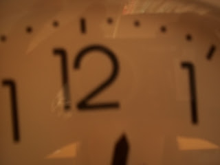
 - An extreme close up of the time (One number on clock)
 - A big close up of someone using a mobile phone (Just face and phone)
 - A close up of someone in "nature" (Person's head and shoulders)
 - A two shot in medium long shot (Two people, half of body)
 - An over the shoulder shot of someone writing (Shoulder and hand writing on paper)
 - A very long shot of conveying isolation (Very far away shot of person)
 - A medium close up (Above the waist, head and shoulders)
 - A long shot (Whole person)

- A photograph which has connotations of friendship (Situation or object which could indicate friendship without using a whole person)
 - A photograph which has connotations of stress (Situation or object which could indicate friendship without using a whole person)


A very long shot of conveying isolation (Very far away shot of person)

An over the shoulder shot of someone writing (Shoulder and hand writing on paper)

A photograph which has connotations of friendship (Situation or object which could indicate friendship without using a whole person)

A big close up of someone using a mobile phone (Just face and phone)

A two shot in medium long shot (Two people, half of body)

A high angle long shot (looking down, whole person)

A low angle medium close up (looking up, half of body)

A long shot (Whole person)

 A close up of someone in "nature" (Person's head and shoulders)

A medium close up (Above the waist, head and shoulders)

 An extreme close up of the time (One number on clock)

A photograph which has connotations of stress (Situation or object which could indicate friendship without using a whole person)

Friday 23 September 2011

Codes and Conventions of the Contents Page

In our lesson today we discussed the codes and conventions of contents pages of music magazines and this is what we discovered:

 - Font size 11 point
 - Contents at top of page and has biggest font
 - Date top of page
 - Main image - dominates page
 - In columns - split into either 2 or 3
 - Sub headings
 - Issue number
 - Page number - anchors the story to image
 - Bold titles
 - Website
 - Title of the features is bolder than the information underneath
 - Mini articles on some of the contents page
 - Can be a double page spread
 - Editor's letter
 - Credits for the front picture
 - Images are different sizes
 - Font is always clear and consistant
 - Sticks to the same colour scheme
 - Article music be about music
 - Descriptions on some of the page
 - Plain background and is in same colours on front cover
 - Main image has the page number - in popular articles the page number is bigger
 - Most of the information is either boxed or boxed shape
 - Page numbers for each story
 - Contact details and address
 - Headings - "Features", "Regulars"
 - Line breaking between each story


Thursday 22 September 2011

Codes & Coventions of Music Magazines

In this lesson we analysed and discussed the codes and conventions of music magazines in groups. This was our outcome:

Masthead
 - Title
 - Positioning Statement - sets out the magazine's ethos e.g. Kerrang "Life is loud"
 - Title kept clear and separate from the image unless the magazine is established
 - The only way it could happen is image is underneath the title
 - Title has unique font which is large and bold - it is not used anywhere else on magazine

Barcode
 - Generally bottom right hand corner
 - Contains:
   -Issue number
   -Date
   -Price
   -Website

Buzzwords
 - 'Plus', 'Exclusive', makes the reader feel like they're getting extra for money or no one else has this

Images
 - One main image
 - Sometimes subsiduart images which are smaller
 - Close-up or mid-shot image
 - No text on face on image
 - Direct address - looking straight into the camera
 - Images usually are relevant to what's inside

Colour scheme
 - Consistant
 - Usually simple colours that don't clash
 - 3/4 colours
 - Colours reinforce the brand

Coverlines
 - Smaller that main image coverline
 - Is in the same style font
 - Always relates to stories inside magazine
 - Relates to genre of magazine
 - Limited range of font; serif, times new roman, san serif
 - Font smaller for a bigger price
 - Plain background

Main image
 - Band image is long shot or medium long shot
 - Artist image is close-up
 - Direct address - look directly at the camera
 - Body language of person in image must fit genre of magazine