This lesson, I researched the band that I was going to write about for my double page spread. The band I am writing about is The Blackout. Below are the links I used to research.
www.myspace.com/theblackout
www.theblackout.net/
en.wikipedia.org/wiki/The_Blackout_(band)
www.facebook.com/theblackoutband
www.theblackout.co.uk/
www.rocksound.tv/features/article/the-blackout
Tuesday 29 November 2011
Tuesday 8 November 2011
Planning Production
Planning Production
Front cover
The front cover main article is about the band Purple Science Hoodie: The Future of British Rock. The main image is of a band member with a purple hoodie and a guitar. The background for the image will be in a science lab.
-Purple Science Hoodie: The Future of British Rock
- The Amplify Tour! Who’s playing?
- Enter Shikari: On their biggest tour yet!
- Led Zeppelin – Everything you need to know
- Greatest Punk tracks EVER
- Win Rob Zombie’s coffin shaped guitar
Text for contents page
It will have both feature articles and regular content with small piece of information on what the article is about. I will also have a small caption under the images I will use.Images for contents page
I shall use photos I have taken at previous gigs. The main image will be of No Lights At Lockdown. My smaller images will be from gigs such as Paramore, We The Kings, Attack! Attack! And Bullet For My Valentine. All picture have been taken by myself.Article for double page spread
The article is about Welsh band, The Blackout. It talks about their latest forthcoming album “Hope” and also talks about the struggle the band had to make it and also an album review.Monday 7 November 2011
Publication Plan
Publication Plan
Title: AMPLIFY
Positioning Statement: Plug into the music
Frequency Of Publication: Monthly
Price: £3.75
Rationale: The approach of the magazine is written by music experts, including band members themselves. It will include interviews and articles from popular rock bands and also focus on a lot of live performances and reviews.
Style: It will be informal and very humorous, not being afraid to make comments that you wouldn’t find in your average magazine. The magazine will also contains simple vocabulary, relatively short paragraphs and musical slang terms so the audience can relate.
Images will be the dominant feature of layouts.
Regular content
- Gig reviews
- Introducing new acts
- Album reviews
- Latest news
- Inside the mind of...
- Stories from the moshpits
- Feedback from fans
- Tracks of the month
- What are YOU listening to?
- The Ultimate Gig Guide
- Win Gig Tickets
- The AMPLIFY Quiz!
Feature Articles
- Purple Science Hoodie! The Future Of British Rock
- MCR’s Gerard Way Speaks Out
- Win Rob Zombie’s Coffin shaped guitar
- Metallica’s Greatest Tour Yet
- Greatest Rock Tracks EVER!
- Matt Tuck’s Guitar Gods
- Drum like Joey Jordison
- The Amplify Tour! Who’s playing?
- Bring Me the Horizon talk about their new album
- AC/DC Still Proving They Have Big Balls
- Enter Shikari: On their biggest tour yet
- Your questions answered by Bowling for Soup
- The Blackout takes over their home territory
- System of a Down’s Top 20 moshpit Tracks
- 30 Seconds to Mars’s times up?
- Led Zeppelin: Everything you need to know
- A7X vs KsE – Who will win in a metal battle?
- All Time Low on tour again
- The Calling make a comeback!
- Skindred’s Benji Webbe has the final word.
- No Lights At Lockdown On Their Latest Album
House Style: Lucida Fax
Cover lines: Berlin Sans FB Demi and Berlin Sans FB
Headlines: Berlin Sans 11pt
Standfirst: Berlin Sans 14pt
Captions: Berlin Sans 10pt
Feature first paragraph: drop capital Arial Narrow, 5 lines deep, first two words in capitals
News first paragraph: First two words in bold capitals
Body Text: Arial Narrow 14pt
Colour Scheme: Purple, Black, Grey
Thursday 3 November 2011
Audience Research
Below is a slideshare of the results from my questionnaire that I made to find out what audience I am aiming my magazine at and what would make them buy my magazine:Presentation1
View more presentations from bethsquires.
Wednesday 2 November 2011
Questionnaire
In this lesson, I created a questionnaire for audience research, so I knew exactly what my audience wanted in the magazine. This is a screen grab of my music magazine questionnaire for my audience:


Tuesday 18 October 2011
Analysis Of Double Page Spread Articles
In this lesson I used prezi to analyse a professional Double Page Spread.
Tuesday 11 October 2011
Analysis Of Professional Contents Pages
This lesson we used Prezi to analyse professional contents pages.
Saturday 8 October 2011
Initial Plans For My Magazine
For this lesson, I decided what my initial plans would be for my music magazine.
-Price: £3.75
-Frequency of publication: Monthly
-Average issue size: 115
-Regular Content:
- Gig reviews
- Introducing new acts
- Album reviews
- Latest News
- Inside the mind of...
-Feature Articles:
- Purple Science Hoodie! The Future Of British Rock
- MCR's Gerard Way Speaks Out
- Win A Date To Nando's With Four Year Strong
- Metallica's Greatest Tour Yet
- Greatest Punk Tracks EVER!
I will use the media pack from Kerrang! Magazine to make sure I am sticking to the codes and conventions of a Rock magazine:
http://bauermediaadvertising.com/uploads/Kerrang!-MediaPack-2011.pdf
Friday 7 October 2011
Researching The Market Place
The task for this lesson was to research real music magazines that would rival my music magazine. I shall be researching music magazines covering the genre of Rock.
Magazine 1: Kerrang!

Price: £2.20
Frequency of Publication: Weekly
Issue Size: 63
Regular Content: Feedback letters & The K Quiz
Feature Articles: Biffy Clyro, Download ticket competition
Positioning Statement: Life Is Loud!
Website: www.kerrang.com
Publisher's Website:
Kerrang! magazine media pack:
http://bauermediaadvertising.com/uploads/Kerrang!-MediaPack-2011.pdf
Magazine 2: Rock Sound

Price: £3.99
Frequency of Publication: Monthly
Issue Size: 115
Regular Content: Gig Reviews & Album Reviews
Feature Articles: 30 Seconds To Mars, Fall Out Boy
Positioning Statement:
Website: rocksound.tv
Publisher's Website:
Magazine 3: Metal Hammer

Price: £4.25
Frequency of Publication: Monthly
Issue Size: 130
Regular Content: Tales from the Pit
Feature Articles: Avenged Sevenfold
Positioning Statement:
Website:www.metalhammer.co.uk
Publisher's Website:
Magazine 4: Big Cheese
 Price: £3.75
Frequency of Publication: Monthly
Issue Size: 122
Regular Content: Album reviews
Feature Article: Paramore, 30 Greatest Pop Punk anthems
Positioning Statement: Punk. Metal. Rock. Since 1996
Website: www.bigcheesemagazine.com/magazine
Publisher's Website:
Magazine 1: Kerrang!

Price: £2.20
Frequency of Publication: Weekly
Issue Size: 63
Regular Content: Feedback letters & The K Quiz
Feature Articles: Biffy Clyro, Download ticket competition
Positioning Statement: Life Is Loud!
Website: www.kerrang.com
Publisher's Website:
Kerrang! magazine media pack:
http://bauermediaadvertising.com/uploads/Kerrang!-MediaPack-2011.pdf
Magazine 2: Rock Sound

Price: £3.99
Frequency of Publication: Monthly
Issue Size: 115
Regular Content: Gig Reviews & Album Reviews
Feature Articles: 30 Seconds To Mars, Fall Out Boy
Positioning Statement:
Website: rocksound.tv
Publisher's Website:
Magazine 3: Metal Hammer

Price: £4.25
Frequency of Publication: Monthly
Issue Size: 130
Regular Content: Tales from the Pit
Feature Articles: Avenged Sevenfold
Positioning Statement:
Website:www.metalhammer.co.uk
Publisher's Website:
Magazine 4: Big Cheese

Frequency of Publication: Monthly
Issue Size: 122
Regular Content: Album reviews
Feature Article: Paramore, 30 Greatest Pop Punk anthems
Positioning Statement: Punk. Metal. Rock. Since 1996
Website: www.bigcheesemagazine.com/magazine
Publisher's Website:
Inital Ideas
In today's lesson we decided what type of music magazine we are going to produce, and discussed our target audience for the magazine.
For my music magazine I have chosen to study the Rock music genre.
My target audience will be rock music fan of both genders and between the ages of 16-25.
For my music magazine I have chosen to study the Rock music genre.
My target audience will be rock music fan of both genders and between the ages of 16-25.
Thursday 6 October 2011
Evaluation

This was the finished product of my School magazine front cover made on Adobe Photoshop.

This was the finished product of my School magazine contents page made on Quark Xpress.
My front page follows the forms and conventions of a real magazine, using methods such as including a barcode, a main image , a mast head which was spread across the top of the page in bold text, i made sure that the eyes on my main image were not covered by any text to gain a captive audience. Also my contents page contains the codes and conventions of a real magazine by using methods such as i organised the page into coloums with headings and page numbers, i then added a few smaller images and kept the bold masthead which spread across the page.
Throughout my front page and my contents i kept the same colour scheme and font. However i have challenged these forms and conventions as i did not use a proper background as i was not very familiar with the software we were using.
For creating my front cover we used adobe photoshop, which was a easy software to use however for my contents page we used quark Xpress which i wasnt very confident with because i had only used it twice before so it was all new too me. So i decided to experiment a bit with the software to gain more knowledge .I found that i was more confident on photoshop than i was on quark Xpress as i had used it many times before and knew exactly what tools to use for certain aspects of my magazine cover. My other strengths in terms of forms and conventions were i was able to follow most of them using my own ideas and designs to create a good school magazine cover. Although i was confident in my front cover i was not so confident with the designs of my contents page as the software i was using was challenging and diffcult to use.
Final Images For School Magazine
Whilst creating our magazine front cover and contents page, we took screen shots of each step we did when making them.
The first 4 screen shots are of my front cover. These were taken when I was using Photoshop to create my magazine.


The first 4 screen shots are of my front cover. These were taken when I was using Photoshop to create my magazine.

The first screen shot is of my main image cut out from a photograph and pasted onto a new page. I also added a mast head across the top of the page.

In the next screen shot, I have added a coverline to my main image and some smaller coverlines at the bottom of the page.

I added a column of coverlines to the left hand side of the page in orange to match the mast head.

Finally, I added a couple more coverlines to the right hand side and this is my complete front cover for my school magazine.
The next 4 screen shots are of my contents page on Quark.

I coloured the background in green and places a different main image in the top left hand corner, leaving a bit of room for a cover line.

Next, I added a title and a column of regulars that appear in the magazine.

Finally, I added another two columns at the bottom of the page for the features of my magazine.
Friday 30 September 2011
Photographs For School Magazine
For today's lesson we each got a camera to take photos for my school magazine front cover and contents page . I took a few photos using different camera angles and shots:


For my front cover's main image, I used a medium close up.

I used an over the shoulder shot which is going to be my main image in the contents page.

I will use this extreme long shot as an image for a feature article. It will be on the contents page.

This medium long shot will also be for a feature in the magazine. This will also be on the contents page.

This close up will be used on the contents page as another feature article.

This is a medium long shot that will be used on the contents page.
Wednesday 28 September 2011
Rough Layout Of Front Cover And Contents Page
In this lesson, I made a rough layout for my front cover and contents page of my school magazine.
This is the plan for my front cover:

This is the plan for my contents page:

This is the plan for my front cover:
This is the plan for my contents page:
Plans for Front Cover and Contents Page
For this lesson, we had to plan and draw out our school magazines. We also had to take photos around the school for the magazine's main images on the front cover and on the contents page.
Plan for front cover:
- Title of magazine: Break Time, Ethos: In school, it's nice to have a break
- Main image & headlines - Close up shot of person with headline "Meet The New English Whizzkid"
- Main colour will be orange
Regulars:
- Help letters
- Competition
- Interview with staff member
- Day in the life of...
- Student voice
Features:
- Free stationary vouchers
- Top 10 revision tips
- How Year 7's are settling in
- Perfect soundtrack to your revision
- The perfect soundtrack to your revision
- How to cope with GCSE stress
- Yr 8's vs. Yr 9's - Who's the best?
- Teacher of the year
- Your thoughts on Uniforms

This is the main image I used for my front cover.

Plan for front cover:
- Title of magazine: Break Time, Ethos: In school, it's nice to have a break
- Main image & headlines - Close up shot of person with headline "Meet The New English Whizzkid"
- Main colour will be orange
Regulars:
- Help letters
- Competition
- Interview with staff member
- Day in the life of...
- Student voice
Features:
- Free stationary vouchers
- Top 10 revision tips
- How Year 7's are settling in
- Perfect soundtrack to your revision
- The perfect soundtrack to your revision
- How to cope with GCSE stress
- Yr 8's vs. Yr 9's - Who's the best?
- Teacher of the year
- Your thoughts on Uniforms

This is my front cover plan of my magazine.

This is the plan of my contents page for my magazine.

This is the main image I used for my front cover.

This is the main image I used for my contents page.
This is the main image I used for my contents page.
Monday 26 September 2011
Practice Shots & Descriptions
For this lesson, we had the chance to leave the classroom and take pictures using different camera shots and angles. We matched these pictures to the list of shots above.
- A low angle medium close up (looking up, half of body)
- A high angle long shot (looking down, whole person)
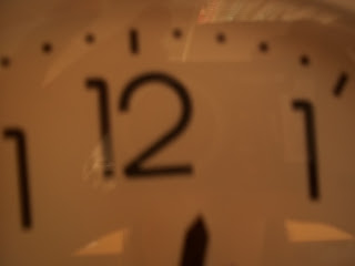
- An extreme close up of the time (One number on clock)
- A big close up of someone using a mobile phone (Just face and phone)
- A close up of someone in "nature" (Person's head and shoulders)
- A two shot in medium long shot (Two people, half of body)
- An over the shoulder shot of someone writing (Shoulder and hand writing on paper)
- A very long shot of conveying isolation (Very far away shot of person)
- A medium close up (Above the waist, head and shoulders)
- A long shot (Whole person)
- A photograph which has connotations of friendship (Situation or object which could indicate friendship without using a whole person)
- A photograph which has connotations of stress (Situation or object which could indicate friendship without using a whole person)


- A low angle medium close up (looking up, half of body)
- A high angle long shot (looking down, whole person)
- An extreme close up of the time (One number on clock)
- A big close up of someone using a mobile phone (Just face and phone)
- A close up of someone in "nature" (Person's head and shoulders)
- A two shot in medium long shot (Two people, half of body)
- An over the shoulder shot of someone writing (Shoulder and hand writing on paper)
- A very long shot of conveying isolation (Very far away shot of person)
- A medium close up (Above the waist, head and shoulders)
- A long shot (Whole person)
- A photograph which has connotations of friendship (Situation or object which could indicate friendship without using a whole person)
- A photograph which has connotations of stress (Situation or object which could indicate friendship without using a whole person)

A very long shot of conveying isolation (Very far away shot of person)

An over the shoulder shot of someone writing (Shoulder and hand writing on paper)

A photograph which has connotations of friendship (Situation or object which could indicate friendship without using a whole person)

A big close up of someone using a mobile phone (Just face and phone)

A two shot in medium long shot (Two people, half of body)

A high angle long shot (looking down, whole person)

A low angle medium close up (looking up, half of body)

A long shot (Whole person)

A close up of someone in "nature" (Person's head and shoulders)

A medium close up (Above the waist, head and shoulders)

An extreme close up of the time (One number on clock)

A photograph which has connotations of stress (Situation or object which could indicate friendship without using a whole person)
Friday 23 September 2011
Codes and Conventions of the Contents Page
In our lesson today we discussed the codes and conventions of contents pages of music magazines and this is what we discovered:
- Font size 11 point
- Contents at top of page and has biggest font
- Date top of page
- Main image - dominates page
- In columns - split into either 2 or 3
- Sub headings
- Issue number
- Page number - anchors the story to image
- Bold titles
- Website
- Title of the features is bolder than the information underneath
- Mini articles on some of the contents page
- Can be a double page spread
- Editor's letter
- Credits for the front picture
- Images are different sizes
- Font is always clear and consistant
- Sticks to the same colour scheme
- Article music be about music
- Descriptions on some of the page
- Plain background and is in same colours on front cover
- Main image has the page number - in popular articles the page number is bigger
- Most of the information is either boxed or boxed shape
- Page numbers for each story
- Contact details and address
- Headings - "Features", "Regulars"
- Line breaking between each story


Thursday 22 September 2011
Codes & Coventions of Music Magazines
In this lesson we analysed and discussed the codes and conventions of music magazines in groups. This was our outcome:
Masthead
- Title
- Positioning Statement - sets out the magazine's ethos e.g. Kerrang "Life is loud"
- Title kept clear and separate from the image unless the magazine is established
- The only way it could happen is image is underneath the title
- Title has unique font which is large and bold - it is not used anywhere else on magazine
Barcode
- Generally bottom right hand corner
- Contains:
-Issue number
-Date
-Price
-Website
Buzzwords
- 'Plus', 'Exclusive', makes the reader feel like they're getting extra for money or no one else has this
Images
- One main image
- Sometimes subsiduart images which are smaller
- Close-up or mid-shot image
- No text on face on image
- Direct address - looking straight into the camera
- Images usually are relevant to what's inside
Colour scheme
- Consistant
- Usually simple colours that don't clash
- 3/4 colours
- Colours reinforce the brand
Coverlines
- Smaller that main image coverline
- Is in the same style font
- Always relates to stories inside magazine
- Relates to genre of magazine
- Limited range of font; serif, times new roman, san serif
- Font smaller for a bigger price
- Plain background
Main image
- Band image is long shot or medium long shot
- Artist image is close-up
- Direct address - look directly at the camera
- Body language of person in image must fit genre of magazine


Subscribe to:
Posts (Atom)